Home Tour: Strider's House - In Need of Some Happy Color
Kylie, back this week from Strider’s House! Strider hasn’t been getting into too much trouble lately (or at least Mommy hasn’t told me about anything lately….) Today we’re taking a look at the living and dining rooms!!
The client has made great progress. And it’s hard - we always tell clients to be REALLY REALLY comfortable with the team you’re working with, especially the contractor. They are going to be allllll up in your grill, day in and day out, from dawn to dusk. Thankfully, we have the most amazing crew at Installations Plus (shout-out to Scott - a man with an incredible sense of humor, which we need these days!) He keeps the show running!
So, not gonna lie. The living room and dining room have been tough for this client and we get it! Lots of difficult decisions to make, especially when you know it’s a long-term change and a substantial investment. Of course, the client would have trepidation - I have trepidation in my own home (although, I think Designers are more indecisive with their own homes. We see too much and are aware of all the wonderful options, oh my!)
These clients are the cutest couple and agree on most everything. But we did need to hit the pause button on the design of the living/dining spaces. There were so many decisions being made in other construction areas and it all became overwhelming! And sometimes you need that mental break, to breathe, regroup and take time to make smart decisions, ones that will bring great joy over the long haul!
So here’s where we came from, and here’s where we’re headed!
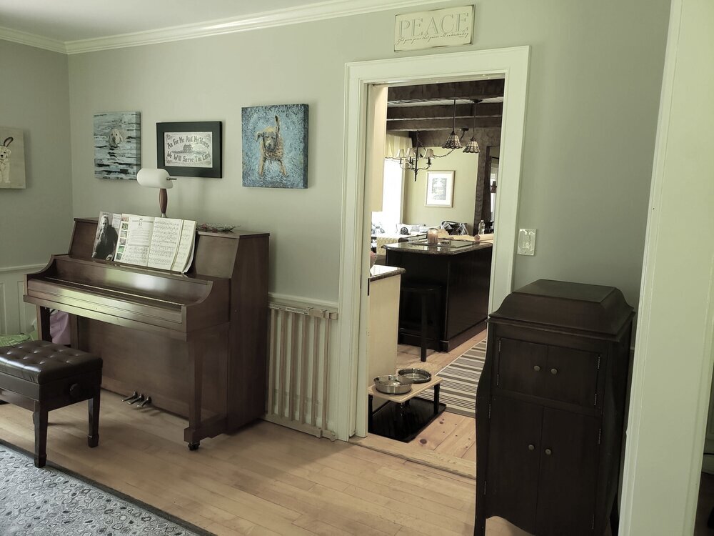
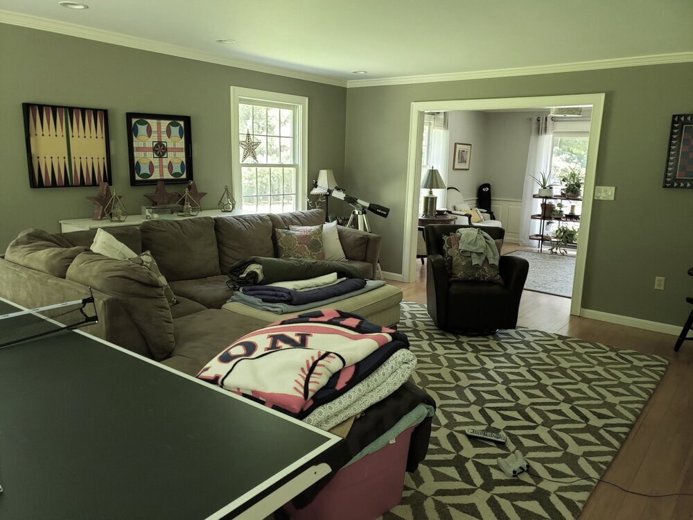
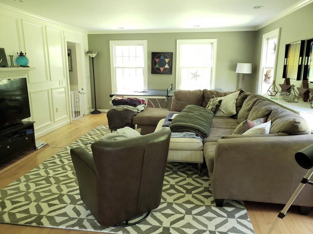
Before
(Why are my cell phone pictures GREEN?!?!?!?!?! Tech Support? Someone?)
Anyway, the green tint aside, the family was ready for an update! Our client plays the piano and her sweet husband can’t wait to listen to his wife play the new baby grand piano he is gifting her. (OMG?!? RIGHT?!?). We asked lots of questions, such as how many people would you like to seat, what “look” do you have in mind and how do you want the space to feel? Placing a baby grand is tricky, there are all sorts of “rules” to be mindful of. Check out the proposed floor plan below and please note it is still a work in progress, almost there!
We found some beautiful chairs for the living room, centered around the fireplace, which will provide the perfect spot to curl up and listen to the piano. (PS - I have yet to hear her play, and I swear, I’m going to make her play for me by the end of this project. I hear she’s amazing!)
For the dining room, we wanted a round table because a round table ALWAYS promotes intimate conversation. And the room was the PERFECT shape and size for one.
We originally started with a soft color palette, but the client decided that it might just be a little too soft. The inspiration came from a gorgeous Lee Jofa fabric for the draperies. The palette expanded from there. (Renderings help with that, thanks to Blue Pixel 3D!)
So, again, the client just felt it was a bit too serene. They wanted more “pop”, and more vibrant color! They decided against grasscloth for the walls. They also wanted to bring nature inside, a more organic feel, similar to the family room. And the client wanted to feel “grounded” in the space. All valid points. Our challenge; how to bring “color” and still keep a serene feel AND tie it back to the family room (see previous blog post for those pictures!!). It was a conundrum, to say the least - but a challenge we were ready to take on!
We did a few more iterations of the design before we came up with the perfect one. Mary found a GORGEOUS rug from Landry and Arcari. It was one of those cosmic interferences where she happened to be in their showroom for another client and found THE RUG that started the entire inspiration for the project. Check this beauty out:
Here it comes - to see it as a loaner in the spacei!!!
It had all the greens as well as yellows, bright like the sun! Reds and different shades of blues. It was STUNNING. So we built the entire design around the rug. We had the rug delivered for a test drive (Thank you team Landry and Acari). The colors were stunning and the light from the windows just enhanced it. So the inspiration began to flow….
Of course, we had to have a real heart-to-heart with Strider becaue this is a NICE rug. Strider is going to have to promise to take care of this rug. He’s a little nervous that he might have an accident - but the good news is our team at Landry and Arcari has a great partner that treats rugs for staining and even gets a warranty for when Strider does have a little teeny accident. Bad boy…..oh but he’s so cute.
So, once the tough decision was made to move forward with the rug, and therefore the rest of the concept, we connected the pallette to the adjoining dining room, playing off of the colors in the living room rug with more blues and reds (and that stunning Oomph lantern!) For the dining room walls, we will use a “Blue Gray” by Farrow and Ball, just to give the space some depth. For the medallion back chairs, we opted for this wonderful embroidered Cowtan fabric for the BACKS of the chairs, just to give it some pop, while using a Schumacher Rocky Performance Velvet on the seats for durability. A Dash and Albert rug was perfect for the dining room - durable and easy to clean!
Now’s the fun part - puttting it all together and coordinating with vendors. This is a LOT of back end work and while we’re SUPER excited and confident about the direction, this is yet another step where some things may change a bit, just depending on stock availability, final pricing (COVID’s disruption to the supply chain is wreaking havoc on pricing…it’s ridiculous). So we fully expect a few minor surprises, but we’ll keep you all posted on the updates!
Subscribe below so you can see more progress of this beautiful home as we have lots more to share over the coming months!
Cheers!


