Modern Farmhouse Bathroom Renovation
It’s been a busy spring for the Bees! We just finished yet another Master Bathroom renovation. The clients were a dream to work with and we had a great chance to complete a modern farmhouse look, which is a bit different from our everyday aesthetic. Not only that, we worked with one of the most amazing contractors in the area: Installations Plus. Check out their work - their attention to detail is superb, such a great group to team up with!
BEFORE
So, let’s start with the Before pictures. The space itself had been remodeled at some point over the years. But of course, as with any major renovation project, we did uncover some issues. You never know what you’re going to find until you start pulling up floorboards or ripping down walls.
FLOOR PLANS / DESIGN
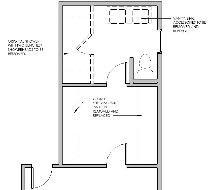
The first thing the client asked for was more counter space. As you can see from the before pictures, the original sinks took up much of the room that would otherwise be used for hair dryers, toothbrushes, etc. So we obviously needed to remedy that! The original shower ran the entire length of the bathroom - it was a large space with two separate shower heads on opposite ends. But since it wasn’t needed (one shower-head sufficed for their needs), we decided to cut the shower back to allow for valuable sink space. In addition, since the client had to walk through the closet to get into the bathroom, it was important to make the closet much more attractive and organized, with built-ins, etc.
CLIENT’S INSPIRATION PHOTOS
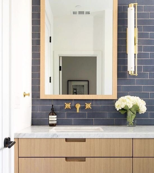
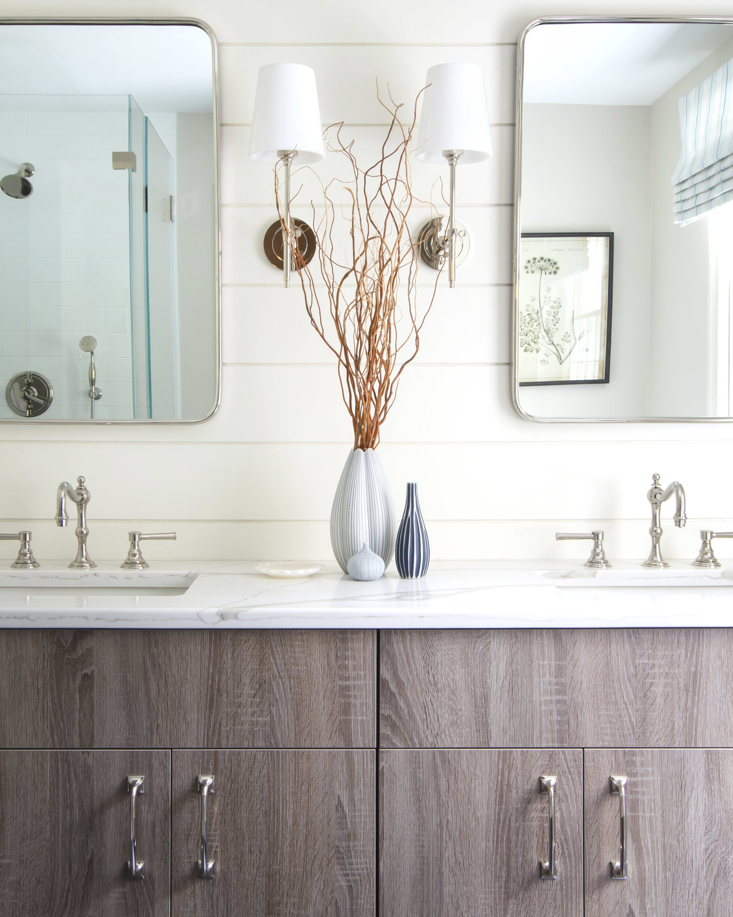
The client had a very specific design style in mind - which is always great to start with. Farmhouse was the look we were going for, complete with “shiplap” behind the mirrors. Charcoal and natural tones took precedence as well as white subway tile in the shower, for a clean and sleek look.
FLOOR PLANS AND ELEVATIONS
As you can tell from the elevations and floor plan, we didn’t make any significant changes of the plumbing locations (which is always helpful when it comes to the budget!) We downsized the shower, as the client wanted, which helped us increase the sink real estate significantly. Adding the shiplap and other details helped create a modern farmhouse look!
Design and Drawings by Bee’s Knees Interior Design, using Autodesk Revit.
Design and Drawings by Bee’s Knees Interior Design, using Autodesk Revit.
AFTER
The final design came together beautifully. We added in a soft roman shade that pulled out the blue colors that the client loved and related to the existing palette in the master bedroom. The curb-less shower was designed so that there was no step entry into the space. Because the shower became much smaller, we worked with our glass installer to ensure there were no frames visible, resulting in a very open feel.
Design by Bee’s Knees Interior Design. Photo by Sarah Winchester Studios.
As we said, the client has to walk through the closet to get to the Master Bathroom. So we wanted to make sure the closet was included in the overall design.
Design by Bee’s Knees Interior Design. Photo by Sarah Winchester Studios.
Check out more photos below!
Design by Bee’s Knees Interior Design. Photo by Sarah Winchester Studios.
Design by Bee’s Knees Interior Design. Photo by Sarah Winchester Studios.
Want additional inspiration? Find our blog articles here! We have another awesome bathroom renovation - a feminine sanctuary… Check it out here!


