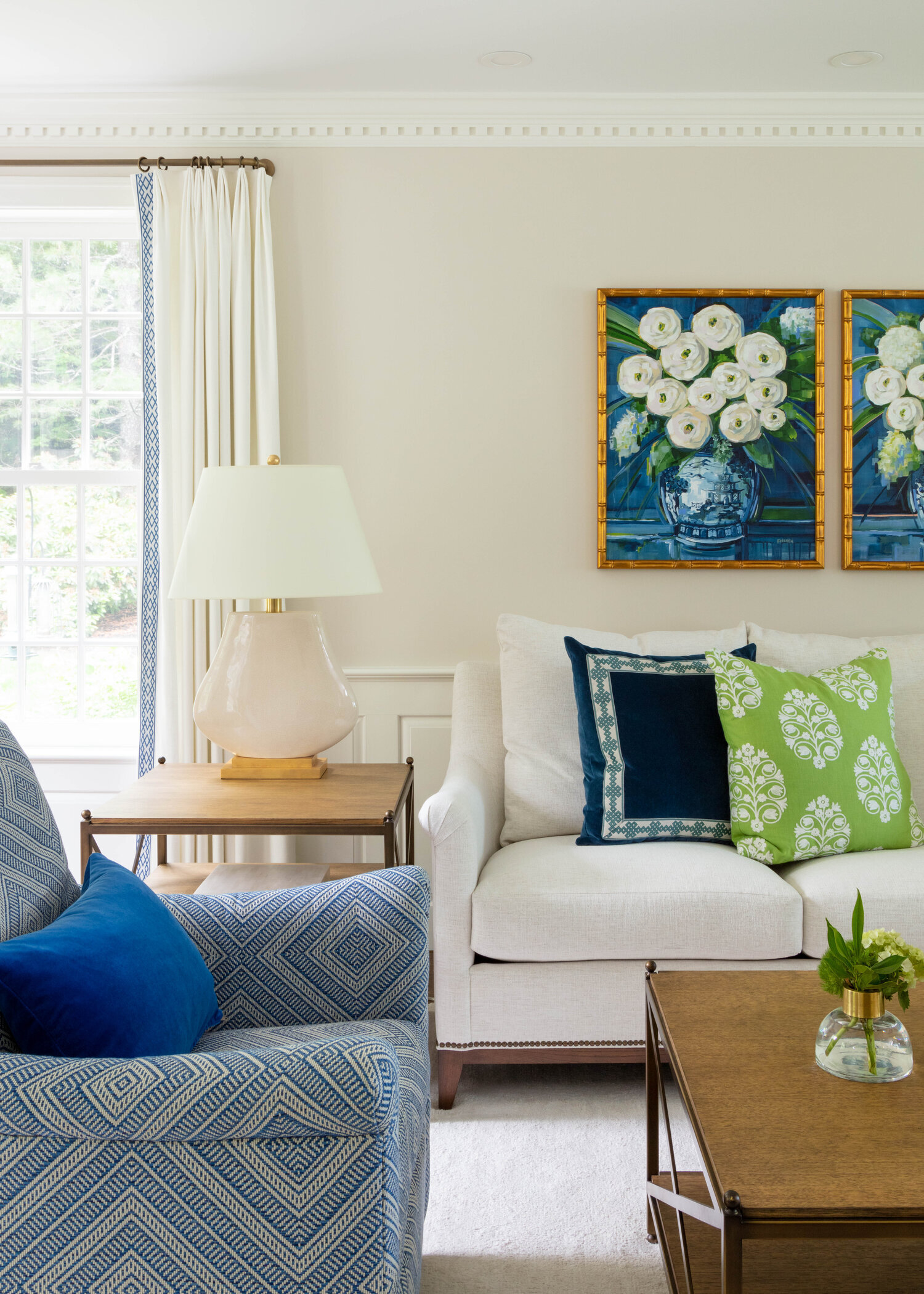
Interior designers reveal decorating rules you should never break (via Insider)
We came across this article recently via Insider and there were a few things that we wanted to scream from the rooftops! Here are our favorite pointers that are Bee-approved!
Never have drapes that are too short!
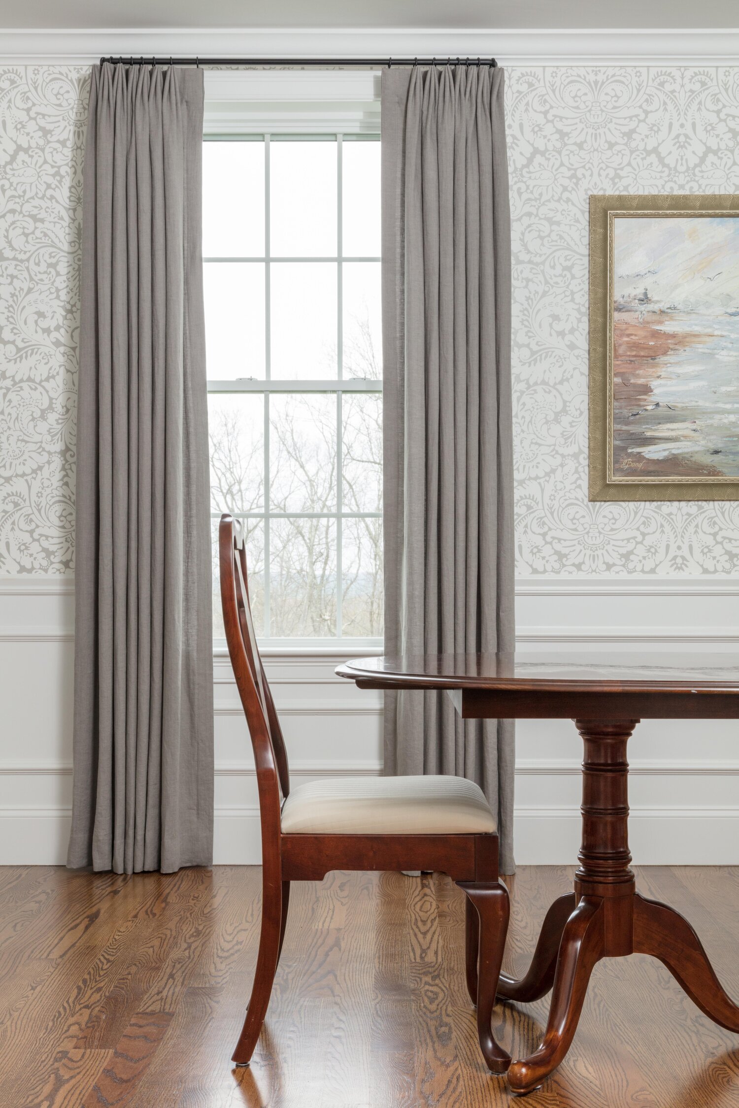
You NEVER want your drapery panels to be too short - it makes the space look short and incomplete! The drapes should always just touch the top of the floor! I love how Lauren White of Ellen W Interior Concepts described it:
Curtains that are too short are like wearing high-water pants….It does not look good and makes your space look unfinished.
We couldn’t agree more! Check out the project below - the Bees ALWAYS make sure that the drapes just skim the floor - kissing the floor, if you will.❤️
Window Treatments by Makkas Drapery Workroom
A rug that’s too small - EW!
Please don’t. Just don’t. If you put in a rug that’s too small, the whole space will look unbalanced. We get it, a high-quality rug is an investment - but it’s much more cost-friendly to do it the right way FIRST than to make a mistake with a cheaper, smaller version. Otherwise, you sacrifice the entire design of the room.
The rug is there to “ground” the space. And the only way that’s going to happen is if the rug is encompassing all of the furniture and bringing it together visually.
As you can see from the images below, the furniture is hosted nicely within the beautiful show-stopping green rug!
Check out the Meredith Cabinet by Bungalow5 and the CR Laine Bradstreet chairs!
Having only one source of light in a room can make the space fall flat
You MUST have more than one light source. When we say this, we’re talking about layering with ceiling fixtures AND lamps, and even a sconce or two! The ambiance it adds is worth every penny and can make the room SING!
Lamps from Port68 and Pagoda Chandelier from Visual Comfort. Jardin Chairs from Bungalow5.
When it comes to expensive, tough-to-replace pieces, you might want to stick to timeless colors and designs.
OMG, it’s like Insider is speaking directly to us!!!! This is what the Bees preach, day-in and day-out. We love to start with a neutral base palette because it allows the room to stay relevent for the long haul. We bring in colors through fabrics and wallpaper. But when it comes to the expensive pieces (i.e. alllllll those kitchen cabinets!) we always start with a nice neutral color.
The other good thing? When it comes to resale value, the neutrals will help sell your home to any potential buyer who wants to put their own spin on it!
Check out the design below: we started with a bright and clean palette and brought in soft shades of pink through the rugs and accessories! We also incorporated some show-stopping light fixtures!
Your space might feel awkward if you hang artwork too high.
Art looks best at eye-level. Don’t hang it too high, otherwise you’re going to have to crane your neck to see it! Start hanging the artwork about 57-60 inches above the floor and adjust from there! Of course there are exceptions to every rule (ahem, Paris Salon Style - look it up, it’s AMAZING.)
Schumacher fabrics, art by Kelly Mason Brookes.
Buying all your furniture from the same collection can make your home look like a showroom.
Sure, if you’re in a hurry, we can see how you might run into a furniture store and say “BUY IT ALL”. But please don’t. Another reason why hiring a good designer is worth the investment. It takes time and an eye to put all the pieces together in a cohesive way. It also creates a “story” within your home - isn’t that what it’s all about?
For more on this story, check out the full article at Insider.


